Geocoding converts an organisation name or address to a geographic location that can be plotted on a map.
Fusion Tables has a geocoder built in. Initially we tried asking Fusion Tables to ‘geocode’ based on the names or organisations (it uses Google’s index to check if it has any location information about something of the same name: you can get the same effect with a =GoogleLookup(“Location”,”Placename”) in Google Spreadsheets), but this wasn’t very accurate (lots of organisations with the same names in different parts of the world).
However, once we had merged in charity details from Open Charities, we had addresses with postcodes against all the grants to charities. These were easier to geocode.
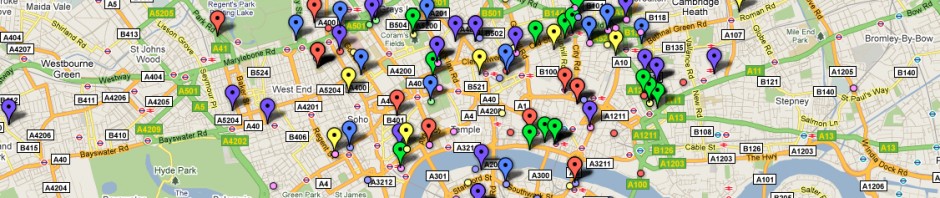
As a result, we could then create a map visualisation of the data such as the one below which shows each year of grants to charities in a different colour, and provides details of the grant, and of the charity, when the icons are clicked.
Other visualisations are also possible (although because of the nature of our data with only years rather than discrete months for grant dates none work as easily). For example, a motion chart shows the changing categories and amounts of grant spending over time.